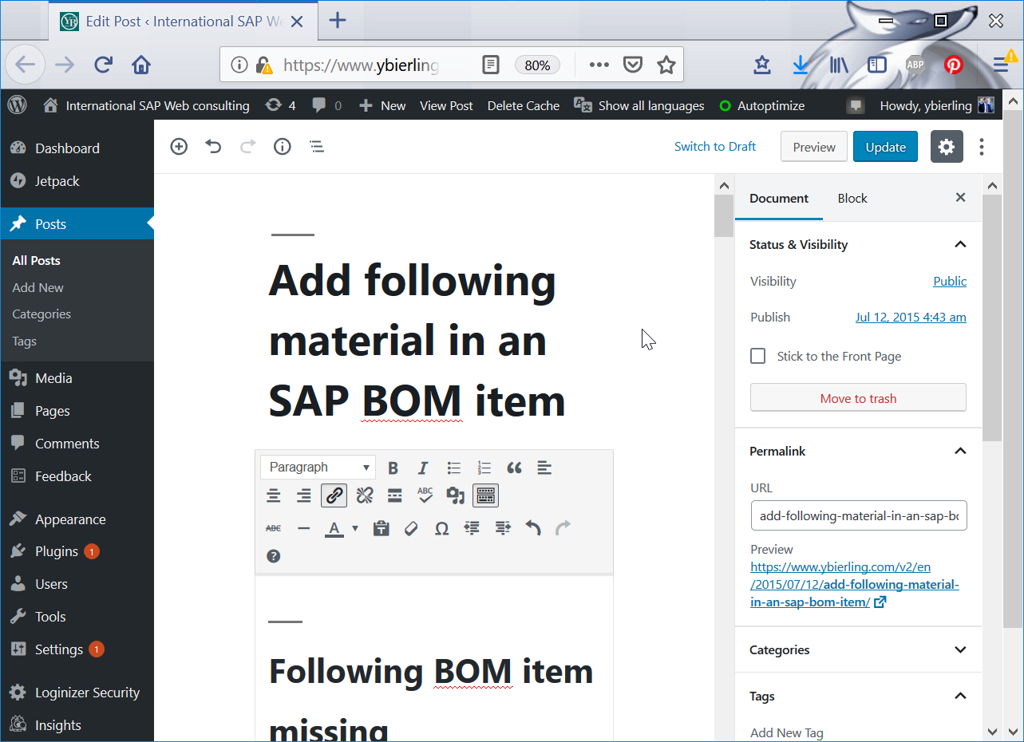
As all WordPress users know by now, Gutenberg is the new default editor of the popular CMS, introduced to great clamor on December 6, 2018, along with the WordPress 5.0 update. Now, a couple of months later, the spirits have calmed so we can all take a level-headed look at what the new editor has brought. Have things changed for the better or for the worse? What can we expect in the future? And, more importantly, how do we adjust?
What’s It All About
In short, Gutenberg is a block-based editor that has replaced the good old TinyMCE editor. The way it works is completely new, and, naturally, requires some getting used to. The blocks have been developed with the ease of use in mind. Much like most popular website builders, Gutenberg works by allowing users to arrange and rearrange simple content blocks around their pages and posts. Just like a kid can build a 10-story building from Legos, so can a WordPress user build a page stacking the blocks on top of each other. Or at least that was the idea.
How It Works
The new editor has quite a different layout, which was to be expected, of course. All your usual fields are right there, except maybe not where you are used to having them. To create a post, you start by adding a block of content of your choice. The default one is Paragraph, and there are other commonly used elements such as Heading, Image, Gallery, Quote, and so on. The most used blocks are listed in the dropdown menu that is revealed upon clicking on the (+) in the upper left corner of the editor, or in the corner of the block itself.
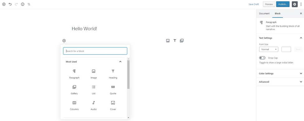
You simply add the blocks and then rearrange them, if you want, using the Up and Down arrows to the left of the block. New blocks can also be added by hitting the Enter key, and deleted using Backspace.
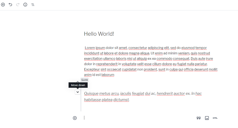
Of course, the choice of blocks doesn’t stop there. Many of the users were concerned about whether or not they’ll be able to insert short codes. However, there’s a special Shortcode block that you can use to paste the piece of code and get the desired functionality.
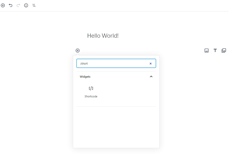
As you can see from the image above, Gutenberg has the “slash autocomplete” feature in place. It allows you to insert blocks by starting to type their name, instead of searching and adding them from a list.
The Undo and Redo buttons are located in plain sight, and there’s also the Info button, which gives you an overview of the content you’re currently editing – total word count, the number of blocks, paragraphs, and so on.
Additional block and content settings are located on the right-hand side of the editor, with clearly marked and self-explanatory options.
The new editor also brought some brand new features. For example, the Recent Blocks feature helps you edit your content more efficiently. This is a useful thing to have, since developers keep creating and adding new blocks, and navigating through them all will probably become a bit tricky.
Also, the new editor now offers new options for editing your text, such as background color, drop cap and font size.
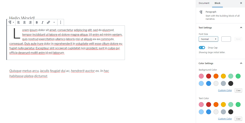
All in all, Gutenberg is made for simplicity and ease of use. It’s meant to make things easier for beginners and intermediate users and to offer developers something solid to work with, too. But, if the whole point was to make WordPress even easier to use than it already was, how come it’s being met with such skepticism?
How do Users Feel About Gutenberg?
Most of us are reluctant to accept changes, even if they’re for the better. In case of Gutenberg, the good people of WordPress did their very best to persuade us that the change is, indeed, for the better. And yet, judging from the number of negative reviews the new editor is getting, users do not seem amused, nor impressed.
The ratings are not exactly favorable, either:

It’s not even just about the negative reviews. After all, unhappy customers are more likely to leave comments and reviews (well, rants) than the satisfied ones. However, after the Gutenberg launch, the WordPress team made sure to let everyone know that the Classic Editor plugin is still available, although not bundled with WordPress, and can be used instead of the new editor.
Take a look at the chart representing the number of Classic Editor downloads per day. Notice the giant spike around the time of the Gutenberg release?
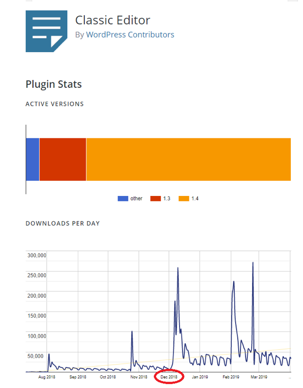
The number of downloads and active installs of the plugin continues to grow, which proves that people are generally not thrilled about Gutenberg.
The Good and the Not-So-Good
Looking into the user reviews, there are a few things that can be safely identified as particular pain points, and a couple of those showing that WordPress did get something right by releasing the new editor:
Pros
- Ease of use (especially for first-time WordPress users who never used TinyMCE)
- Slicker, more intuitive interface
- Better content structuring abilities (moving content up and down)
- Drag&Drop interface for moving the blocks
- Adding galleries as a block, rather than as a shortcode
- Ability to hide the sidebar and switch between editing modes (full screen, full page)
- Keyboard shortcuts
- Easily reusable elements
- Individual block settings and searchable blocks
- Making rich custom layouts with no coding skills required
- Plenty of room for plugin and theme development.
Cons
- Steep learning curve for old users
- Issues with compatibility with plugins and themes
- Poor accessibility due to lack of certain APIs
- Missing Markdown support
- Automatic (forced) switch of editors
- Confusing interface (double scrollbar, double-sided sidebar…)
- Some of the old keyboard shortcuts don’t work
- Needs a lot of ironing out
- Risk of breaking existing themes and plugins.
You’ll notice that certain things, like the ease of use and the quality of the interface, appear on both lists. That’s simply because it all depends on the user perspective. For some users, Gutenberg really is quite simple and clean while for others, who are used to working with the old editor, it appears counter-intuitive, complicated and messy.
What’s Next?
When the new editor came out with the WordPress 5.0 update, it was announced it would roll out in four phases over the next year or two. The first phase was the one that caused the most confusion, and the following phases are expected to come through somewhat more peacefully. Phase 2 is already underway and the dust has settled significantly, so we can definitely expect more stability in the days to come.
While Phase 1 focused on basic content creation and editing using the blocks, Phase 2 is planned to take the blocks “out of the box,” so to speak. They’re going to leave the confines of pages and posts and move to widgets, menus and other elements. In a way, during this phase, Gutenberg is going to start morphing from a page editor to a site editor.
Phase 3 is going to be all about collaboration, workflows and multiuser editing, and it’s planned to roll out in late 2020 or perhaps even 2021.
As for Phase 4, it will most likely involve multilingual features in the WordPress core, as an “official way” to support multilingual sites without having to resort to WPML and similar solutions.
Tackling the Weak Points
Even though the negative reviews and poor ratings are somewhat alarmingly high in number, at least they don’t seem to be affecting the fundamental concept of the new WordPress editor. Rather, they aim at the way the transition is handled, the lack of proper onboarding, the launch itself. All these things can be easily remedied, so it’s safe to say that, despite everything, Gutenberg is going to stick around.
One of the things in favor of this assertion is the fact that WordPress users are generally very favorable towards page builders, whether they’re built-in or added as a plugin. It should be stressed that Gutenberg itself is not a page builder, but we can’t ignore the fact it shares some of the functionalities of a page builder, such as the drag and drop features and easily added custom styles.
Therefore, it’s clear that users need something more than what TinyMCE had to offer, especially in terms of flexibility in creating rich content. Gutenberg, as it is right now, may not be the final solution we’re looking for but it may well be the missing link, a good step in the right direction.
In this sense, it’s a good thing that Gutenberg is here to stay. But, obviously, some things will need to change.
For instance, it wouldn’t hurt to offer users a more transparent and immediate choice between the old and the new editor. Right now, when you download WordPress, you only get Gutenberg. The Classic Editor is available as a plugin, and even when you have it installed, you need to set it as your default editor, otherwise you’ll be served Gutenberg without being given a choice.
Another thing that might help would be to offer some sort of more comprehensive, easy to follow onboarding guidance. One of the most commonly heard complaints about Gutenberg is that it’s “hard to learn/use.” On the other hand, plenty of users find it refreshingly user-friendly.
Right now, the only piece of instruction the users get regarding the new editor is where to click to add a block and where to find the settings. That’s clearly not enough. Obviously, a lot of negative feedback could be resolved simply by stepping up the assistance and support for those who need it in the initial adoption phase.
Final Thoughts
It’s safe to say that three things are true:
- A lot of people don’t like Gutenberg.
- A lot of people do enjoy Gutenberg.
- Gutenberg is not going anywhere.
The good news is that, judging from the changelogs, WordPress seems to be working very hard to fix the bugs, improve user experience and bring new features. Hopefully, they’ll continue to listen to the user feedback, especially from plugin and theme developers and other active members of the community. It’s the only way Gutenberg can overcome its growing pains and become a truly revolutionary content creation tool.

