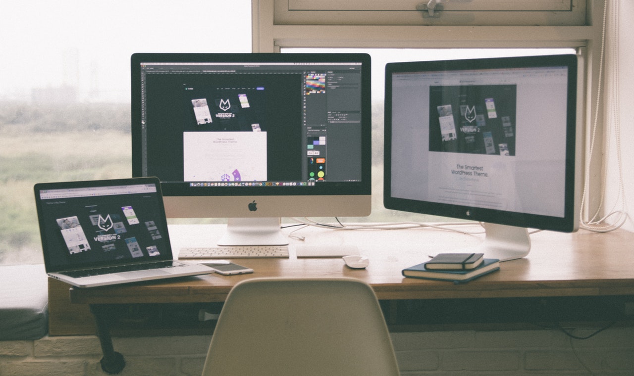
We regularly talk about the latest web design trends. Sometimes they stay as predicted at the beginning of the year, sometimes new highlights pop up and take over the scene, and very unexpected solutions and ideas become popular. So here’s a short update on what is going on in web design, based mostly on the website ideas we discovered.
Brutalism goes mainstream
Brutalism is in the spotlight this year, and it will remain a highlight in web design for a while. Brutalism intentionally aims to look raw and unadorned, as if bringing back the aesthetics of the 90s in a more sophisticated manner.
Split screen
From real estate website templates to online magazines, you will find some interesting interpretations of split screen design, often with contrasting colors helping to place the accents. It often helps to achieve the balance between text and visualization.
Vintage typography
Even despite the commitment to minimalism, vintage typography remains a trend. New fonts are inspired by calligraphy and ancient writings, and if used properly, they help to establish the brand’s visual identity.
Data visualization
The abundance of the information we consume daily and our distractible attention make it difficult to read long texts and serious materials. Infographic is an entirely different thing. Data visualization helps readers to stay focused on the subject and memorize the information they learn. Also, it is beautiful.
Black & white
The world isn’t black and white, but b&w looks awesome for websites. If you don’t want to make your site entirely two-colored, think about integrating a b&w block, like in some of the recent music website templates we’ve found on Weblium.
Vibrant colors
Interestingly, this trend managed to co-exist with the previous one peacefully. Vibrant colors have been inspired particularly by brutalism. “Vibrant” embraces both extraordinary, simply bright, and acid colors. The unexpected combinations are welcome.
Gradients
Gradients are everywhere: from a picturesque sunset with its purple-to-green color palette to product websites and outdoor advertisements. Maybe there’s a psychological explanation for the recent popularity: gradients look calm and chilling, and that’s exactly what we admire in the stressful present-day reality.
Smooth lines
We can tell the same about smooth lines and minimum sharp edges in website aesthetics. It is an interesting way to integrate different colors and elements, which goes from relaxing to surrealistic in the interfaces with “never-ending” approach to design.
Flat + 3D
If you cannot visualize this one instantly, think of it as minimalist design that features only 3D objects. It is especially effective for product websites, e-commerce platforms, and tech websites. For example, you can create manuals by placing a device in the center and letting users rotate it, click on different spots with popup explanation. The same thing works well for product presentation.
Glitch art
Back to old school aesthetics, glitch art is associated with hi-tech and a little bit with sci-fi themes. Most likely, it will become a highlight of record labels templates and gaming websites. But if you have an idea how to use it for other website types, do it!
Micro-interactions
Micro-interactions are mainly animated objects that are activated as you scroll down the screen and move a pointer around the screen. Colors start to change, some elements start to move, cards start to flip, and it all looks like some magic, encouraging users to stay on a website for a while at least to check out all the interactive elements.
Chatbots
The AI website design is becoming more popular thanks to facilitating the website usage. The approach we call “intuitive design” focuses on making everything easy for users. There is no need to guess where to click and how to use an app, a desktop or mobile version of a website — it is always clear without explanations. Chatbots are a next-level improvement. They help to save the company’s resources, collect data, to communicate with customers more effectively, and enhance the user experience by fast responses.

