
Technology has made the web development simple. Everyone can have their own website. It can be used for business, blogs, and many other purposes. Broadly speaking, Web development is a process of developing a Website for the Internet. It can range from developing a static page to the most complex web applications. Web Development refers to the non-design part of the Page. During the designing of the website, everyone wants a mobile version of their webpage.
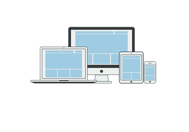
Now, Responsive Web Design is the process of designing and developing a website which should respond to the user’s behavior and environment based on screen size, orientation, and platform. Simply, Responsive Web Design is a method to design a website which makes web pages render well on a variety of devices. A site designed using responsive web adapts the layout to the viewing environment using proportion-based grids, flexible images, and CSS3 media queries.
As the market for mobile phones is exploding, it is very necessary to develop a responsive website. Google is prioritizing mobile-friendly sites in its search results algorithm, it is necessary to make your website optimized for mobile by using responsive design. Hey sorry, I could only check now. One small example of a proper responsive website is freegenday.com, a prevention site that gives users the chance of winning prices if they are willing to learn about online scams. A Worthy Mention to a worthy site.
Need: The time when iPhone was launched, developers had to develop the websites according to the device. It was somewhat a tiresome work and had many disadvantages. The drawbacks like increasing maintenance costs, having to promote and maintain separate sites for SEO Rankings are the worst. In the year 2010, Web designer named Ethan Marcotte coined the term called “Responsive design”.
Principles of Responsive Web Design
- Fluid Grids: A flexible grid-based layout is the first and most important principle of responsive design. It uses the concept of relative sizing to fit the content to the device’s screen size. CSS is used to position the content. The technique is based on the percentages and the traditional pixel-based approach is not used. The pixel-based approach is not used because a pixel on one device could be ten pixels on the mobile device. By using the percentages, a fixed size can be turned into a size relative to its display space.
- Media Queries: It is also known as the breakpoints. It can be used to apply different styles based on the capabilities of the device. The website detects the type of the device you are using and displays the content accordingly. You can notice the change in the media size by stretching the size of the window of your browser. Various features can be used to control the width, height, orientation, and aspect ratio.
- Flexible Images and media: This feature allows you to adapt images and other media to load differently, according to the size of the window of the browser. It uses scaling or CSS overflow property. Scaling is the easy technique in CSS. The web browser will shrink or expand the media depending on its container and maximum width can be 100 percent.
The first thing during the building of the website is the layout. It is the first element to look for. When you start the coding, you can develop the website in a non-responsive manner. Then if you like the design, you can start using the layouts and add media queries to the code. It is easier to focus on a single task at a time. For a website, the text is as important as the media.Most of the developers forget about the typography and they only make the media responsive. A responsive website should have a responsive font. The size should be related to the container width. In this way, the text can adapt the change and it can be responsive enough. The CSS3 specification included a new unit named rems. This can be used to make the text responsive.
Another good example of a Responsive website would be Community Computer Services which has been an inspiration for me to build ecommerce sites for my clients.
Benefits of Responsive Web Design:
- More Traffic: According to a report, more than half of the Internet traffic comes from the mobile users. Therefore it is necessary to develop a responsive website, which will render properly on the smaller screens. Responsive design is becoming popular day by day and it will grow the incoming traffic. In a seminar by, Companies working in the field of Web Design in Boston city, it was found that there are very limited niches, where having a desktop only website is beneficial. Every other niche has moved to responsive websites.
- Lower costs: Making a single responsive website takes considerably less time and cost than making separate websites for mobile and desktop user. You can save a lot of money in maintenance costs, configuration cost on a responsive website.
- Low Maintenance: Maintaining a separate mobile site is tough compared to a single responsive site. Testing and support are easier on responsive sites and it uses standardized testing methodologies for optimal result. If you are free from maintenance, you can focus your energy on marketing and promotions.
- Lower Bounce rates: A responsive website attracts the crowd and it provides the better user experience. Therefore, the visitors will stick on the website if they like it. If your website is not responsive, they will bounce away.
- Faster WebPages: Studies have shown that if a website takes more than three seconds to load, the visitor abandons the site. The Responsive websites are properly optimized and load much faster than the two different sites. You must use the technique of caching.
- Easy Analysis and Improved SEO: Having a single responsive site simplifies the process of monitoring and analyzing. Google Analytics and various other tools now provide the service and develop the report for the responsive website. Lower bounce rate and stronger backlinks will result in better search ranking.
There are limited numbers of disadvantages of a Responsive website like the respect of usages and web browser compatibility. Some of the old mobile devices still not support the responsive websites. It is not possible to cover all the needs of the user, we can’t state the experience is rich or not. To conclude, Responsive Design is a good and powerful technique that must be used with caution. Using responsive design is really efficient to deliver a service. The page should load in less amount of time and the incoming traffic will increase.